Questions? Contact Jordan Hoeft, the Center for User Experience or the UW Office of Compliance.
Accessibility Guides
Accessibility Checking Tools
Plain Language Resources
- Tip: Microsoft Copilot and Google Gemini can give you suggestions on how to improve your text using plain language principles!
- Learn more about using AI at UW–Madison.
Digital Accessibility Checklist
1. Use plain language
- Put key information up front and keep things short.
- Support skimming with headings, bullet points, and content summaries.
- Write in active voice (i.e., subject of the sentence performs the action).
Example:
- Original:
- All candidates must complete the application in full, and the application must be received by our office no later than the date of August 1st.
- Plain language:
- Submit your completed application before August 1st.
See more examples from the University of Michigan.
2. Use contrasting colors
- Make sure text and background colors are starkly different.
- Use a solid-color background; images behind text are distracting and make the text more difficult to read.
3. Name links appropriately
- Write unique, meaningful text that describes the action or destination of the link.
Examples:
- “Submit application” is better than “Click here to submit”
- "Read more about IT help" is better than "Find information about IT help here"
4. Use large text and high-quality images
- Remember that many people use mobile devices with small screens and use zoom-in features.
- Use text at least 12pt in size.
- Low-quality images and images of text often become fuzzy or pixelated and difficult to read.
5. Add alt text to images
- Use alt text to briefly (150 characters) describe the image to people who use screen readers.
6. Use Microsoft’s Accessibility Checker
- This built-in tool found under the Review tab gives details on potential issues and suggestions to correct them.
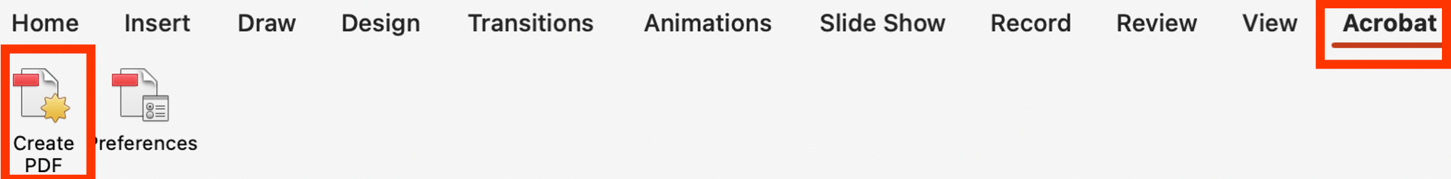
7. Use Acrobat’s Create PDF tool
- If the document will be converted to a PDF, start by making sure it’s fully accessible.
- If Adobe Acrobat Pro is installed, use the Acrobat Tab then select Create PDF. Or, use the online conversion tools.
- Always avoid using “Print to PDF.” It typically doesn't format things correctly and makes documents inaccessible.
Image